
Overcoming Distribution Challenges with Bicycle Sharing
When I left the house to grab a beer with some friends in the evening of September 29th, I found myself in an unexpected situation. I usually take advantage of Madrid’s rich offer of mobility sharing systems to go places, but this time, the locations of the scooters were completely displaced. The majority of them were clustered around the Estadio Santiago Bernabéu waiting for people who were watching the local football match between Real Madrid and Atletico.
People like me in other areas of Madrid faced a shortage of available vehicles. I thought that many shared mobility providers probably face this kind of distribution challenge and that it could be interesting to analyze the vehicle distribution data with Graphext.
Our team set out to investigate how mobility providers can ensure that their vehicles are properly distributed across urban areas.
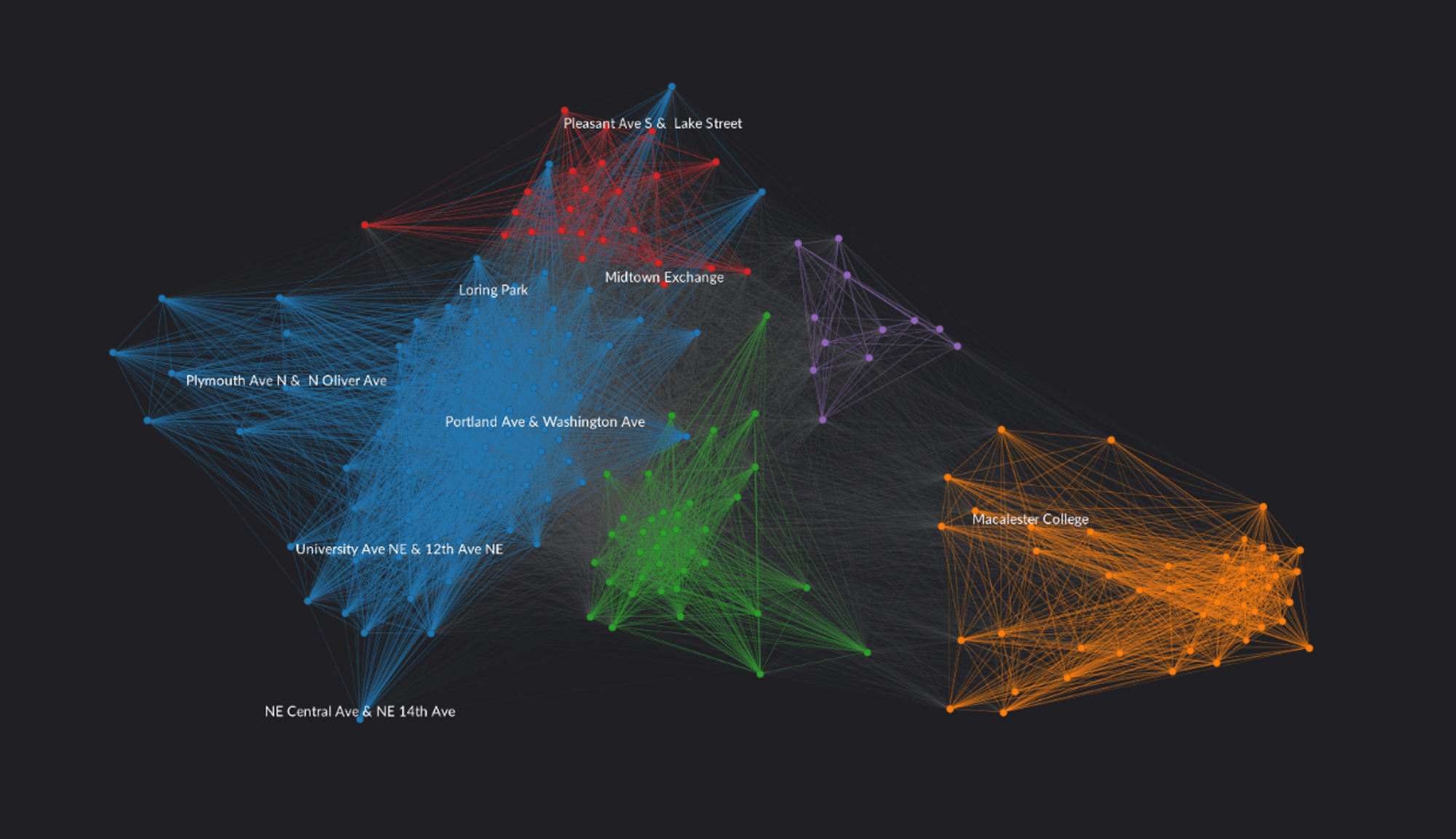
With Graphext we analyzed the vehicle distribution data of a bike sharing service based in Minnesota. One dataset contained information about every trip - duration, user type, date, start station, end station - the other one about the bike stations - location, number of docks. We created a project in which each node represents a station and each link represents trips between two stations. Stations that share many trips together form the clusters you can see in the Graph below. We can identify exactly five of these communities in our network graph. Let’s have a look on how well the bike sharing provider maintains the distribution of its bikes.
Docks vs Demand
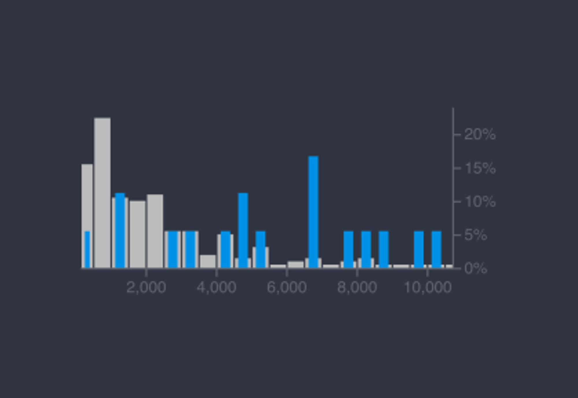
In order to check how well the provider maintains its stations with an appropriate amount of docks, we set a filter for the stations with the largest capacity ranging from 25 to up to 40 docks, and plotted them against the number of trips completed. We found that the large stations are also the most demanded ones. The blue bars in the chart below represent the distribution of our selection of the biggest stations and the grey bars show the distribution of the whole dataset also including the small stations. At a first glance, it seems that the provider is well aware of its distribution challenge and always meets the customer’s demand.
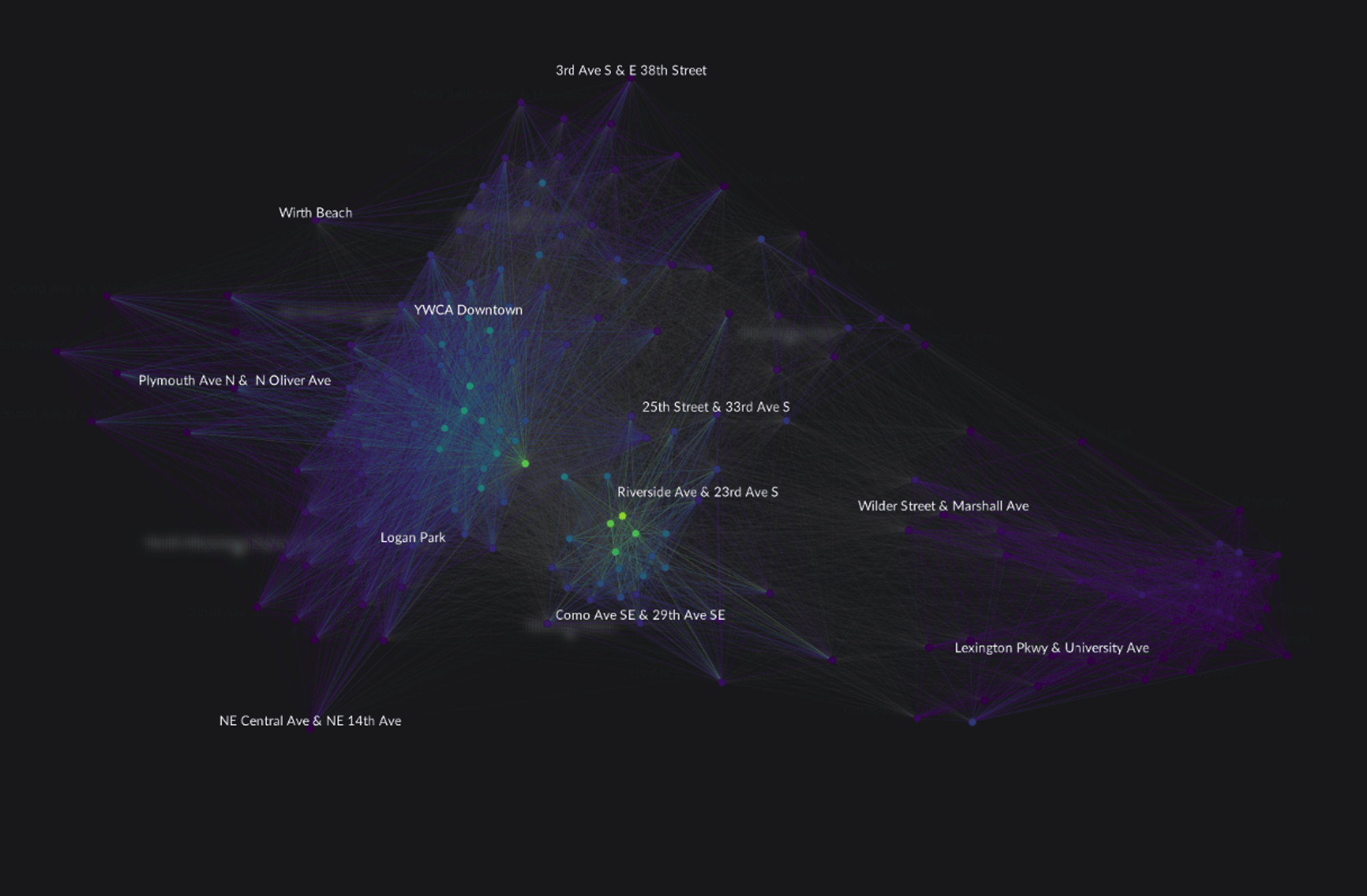
But are all areas with a high demand already sufficiently covered? To answer that question we created a selection of small stations with no more than 25 docks and used a heat map to show the number of trips between these stations.
As seen in the Graph below, the more yellow the node is, the more demand there is, the more purple the less demand. We would have expected to only find purple nodes in our selection because we filtered for small stations only. However, we can see in the graph that there are at least five nodes marked yellow. To be clear, that means that at these stations the capacity is completely maxed out. The provider should consider to increase the amount of available docks and bikes. Otherwise it won’t meet a raising demand and waste potential revenue, or even worse, in these areas the company can lose customers to its competitors.
Capacity amongst the stations marked in yellow is completely maxed out.
Changing Seasons
Another aspect that we need to consider in our analysis is the existence of seasonal demand. The aggregated number of total trips doesn’t say anything about the change in demand during special events. It can make sense to manipulate the distribution of bikes over the city by manually transporting them from one area to another during particular daytimes or weekday such as when a big event like a local football match takes place. Fortunately, Graphext can help to detect the moments and locations for which these manipulations should be put into action.
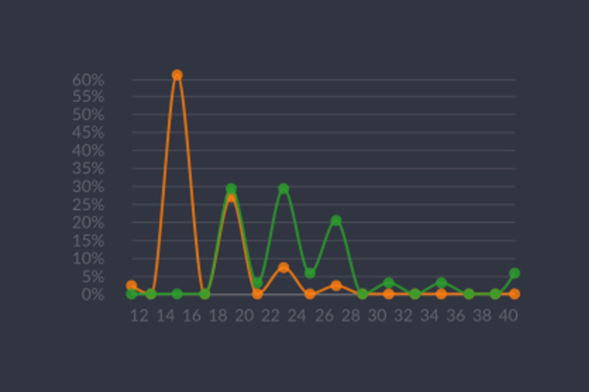
For instance, we suspected that there are differences between weekdays and weekends. To investigate, we created a collection of the stations that have most of their demands during the weekends and another one of stations that are in general very popular, regardless of the time.
We can plot those two collections against each other and compare differences for each variable. Orange represents the most in demand stations over the weekend, green the collection of the overall most demanded stations. We can directly see that there is a major difference between the collections in their relative distributions for the number of docks.
85% of the weekend’s most popular stations have 20 docks or less. Whereas the most demanded stations have between 20 to 28 docks.
Apparently, the demand for bikes varies based on the locations of the city throughout the week. Most of the stations that are mainly used during the weekend only have very few docks: 85% of the weekend’s most popular stations have 20 docks or less. Whereas generally the most demanded stations have between 20 to 28 docks. Thus, one conclusion the bike sharing company could draw is to temporary expand the capacity of some stations during the weekend. Perhaps it needs to manually transport some bikes on Fridays from one area to another to be prepared for the initial increase in demand on Saturday morning.
With our analysis, we covered several challenges a bike sharing provider can face regarding vehicle distribution. However, there are many more issues to address. For example, to detect suitable times for promotion campaigns we could investigate the different behaviors of one-time users and frequent customers. If there are certain stations that are – at certain weekdays – more favored by one-time users than others, the provider can consider to offer discounts for subscriptions or bonus packages if you purchase minutes in advance.