
Finding a New Brand Identity with the Graphext Design Team
As our product evolves, the brand around it evolves too. For Graphext, that moment has now arrived.
We were busy enough making sure we were building from scratch the best insight discovery solution to even stop and think about our identity. Now we can confidently say we have set the foundations of a consolidated product and we feel it was about time that our brand reflected that too. Today, we are happy to show the world our new look.

Starting Out
Our main motivation to adopt a new brand identity was that we did not own a clearly defined one. Instead, we had an original logo that, while it represented Graphext original nature, felt quite cluttered.

Our first original logo made with an actual Graph (left) and a transitional logo that aimed to simplify the initial one (center)
The meaning was definitely there - we were representing a Graph of a context. Initially we felt like this was all that was needed because it clearly expressed what Graphext excelled at; analyzing and mapping out contexts in a network visualisation.
But on the other hand it lacked so many things. We needed to show that Graphext wasn’t just another data analysis tool. From a more pragmatic perspective we needed it to be more compact and less complex.
On a failed attempt to fix the problem quickly we went for simplification. We got rid of the dotted pattern that filled the graph and replaced it with a gradient. And the result didn’t actually fix any of the problems we were experiencing.
Identifying What We Wanted
We needed something that reflected Graphext uniqueness. We didn’t want to feel like any other tool on the data analytics industry because Graphext is not like any other analytics tool.
We did our research and this is how branding in the analytics market right now.
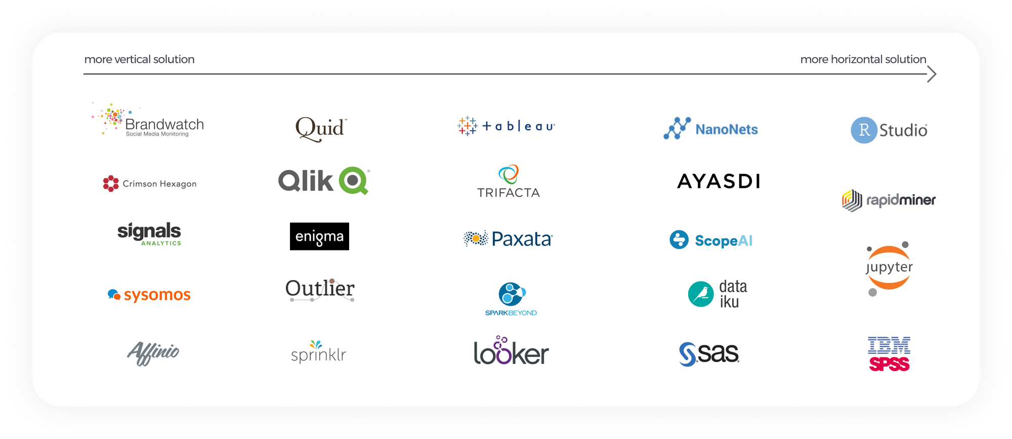
We found an overwhelming use of graphs and data points and identities that aimed to look futuristic. And this is everything we were trying to avoid, because even if Graphext belongs to the data universe, it is far from any other solution in the market.
Also, we needed our new logo to be simple and memorable. It needed to fit well within our data-centered UI and be recognizable in any context. Also we wanted it to be adaptable so that we could use just the icon alone or together with the lettermark.
Key Points to Reflect
- Graphext is powerful and easy and that is what our logo should represent.
- Not use traditional iconography related to data (graphs, magnifying glasses…)
- A unique approach to the data analytics field.
- Simple yet meaningful. Simple so that everyone could recreate it off memory.
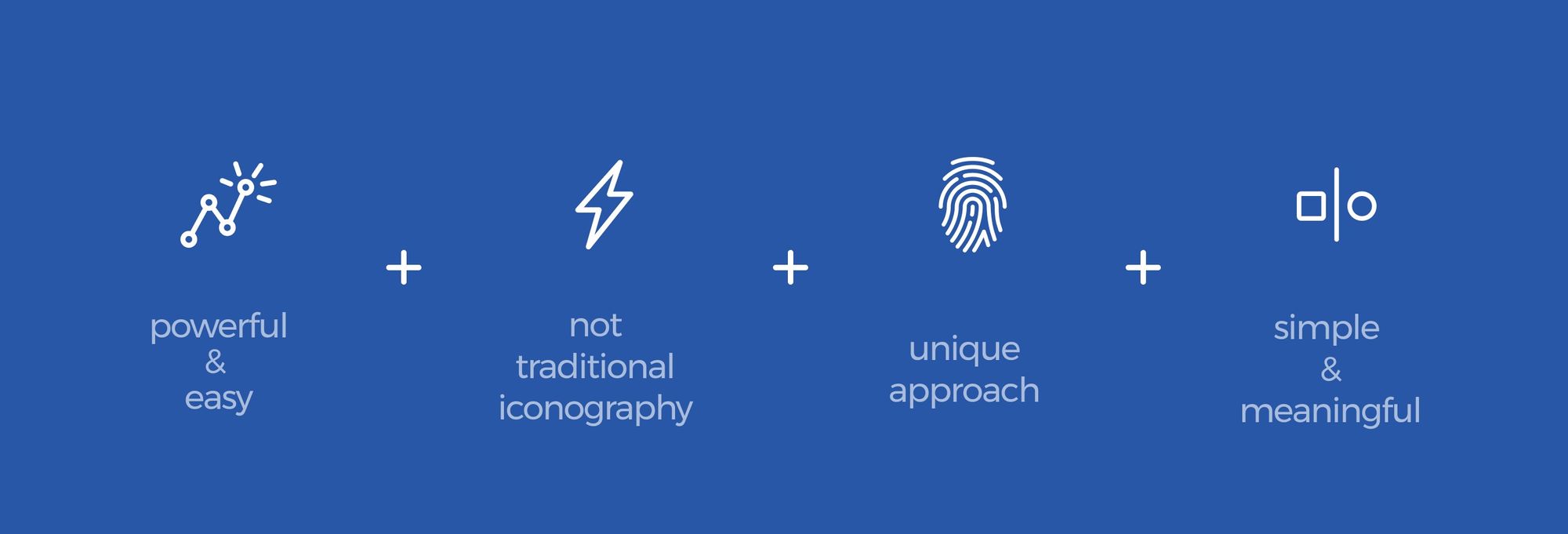
Conceptual needs of our new logo
Functional Requirements
- Recognizable in all sizes and colors.
- Maximize the space in a square or circle (important for social media and thumb images)
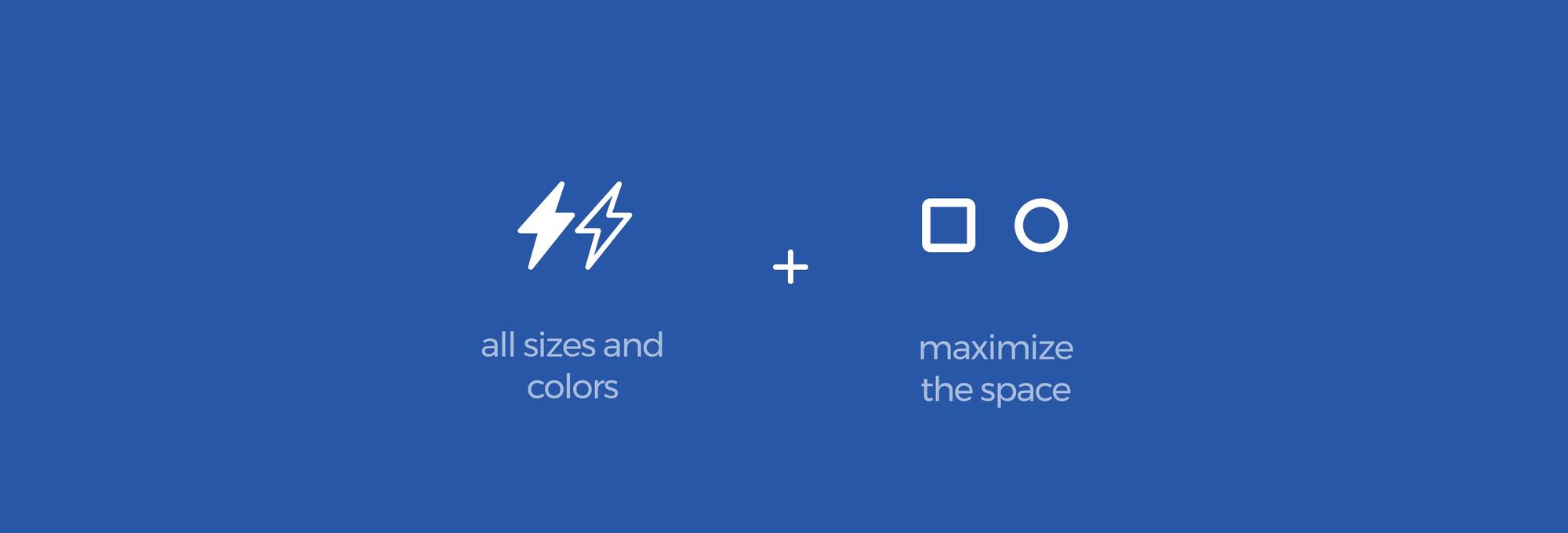
Functional requirements for our new brand
The Creative Process
As we were looking for a disruptive iconography to symbolize our insight discovery solution, there were absolutely no limits nor rules. We started experimenting with geometrical patterns from la Alhambra, as Granada is Graphext’s hometown. We then pursued more natural icons of the city, such as Sierra Nevada or even a pomegranate. All the proposals were loaded with meaning and a personal attachment, but none of them spoke out Graphext vision.

Concept proposals for our logo, all based in Granada's icons
We realized that we wanted our logo to carry more than sentimental value. It really needed to stand up for our vision and the product we had all built.
So we started from our first requirement. Graphext is powerful and easy and that is what our logo should represent. And we studied simple shapes that represented simple yet powerful mechanics, such as bike chains and transmission bands, levers, pulleys and carabiners.
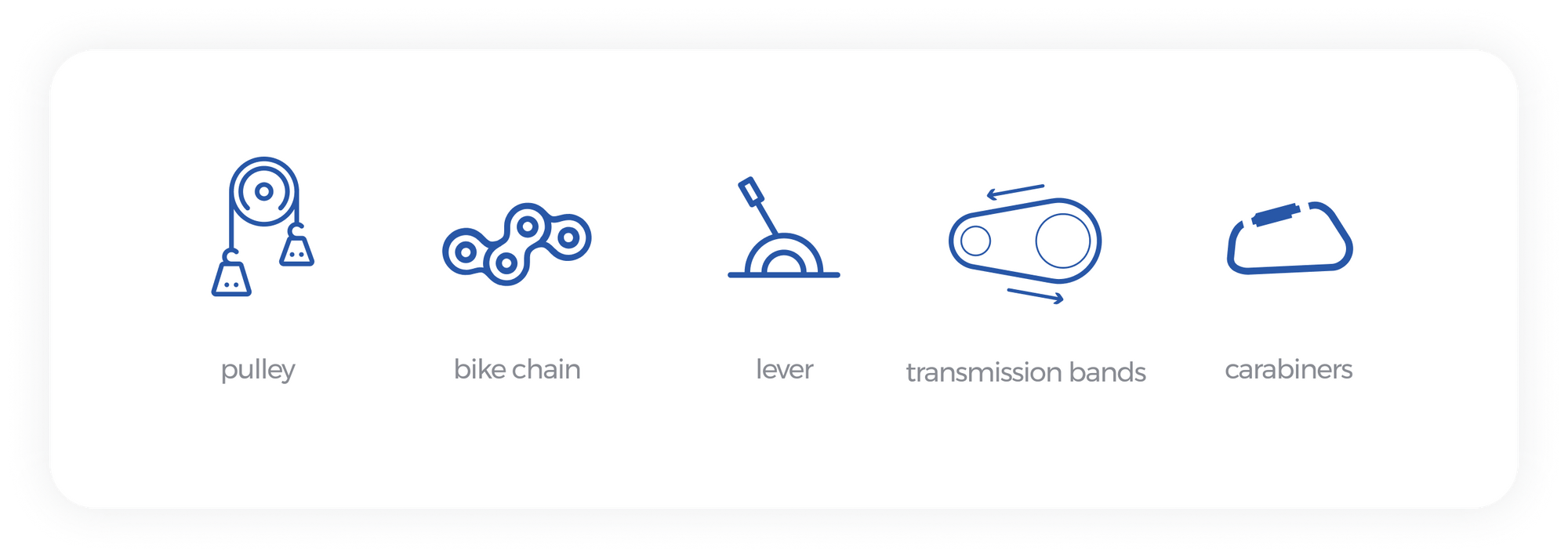
Simple and powerful mechanics studied for the ideation of our logo
As there were absolutely no ground rules and we wanted to keep our minds open to any concept we checked out the design-worshiped book Trade Marks and Symbols of the World by Yasaburo Kuwayama and Yūsaku Kamekura hoping to find an iconography we could us as reference. And it sure helped us, not how we expected, but it made us define the style we wanted: a simple and everlasting iconography.
With that in mind we knew for a fact that we wanted to illustrate a simple mechanic in an everlasting way, the only problem now was deciding what simple mechanic represented us. And the answer to that question came up on serendipity. Taking a look at the allergens list from A Day at Elbulli by Ferran Adrià we found a simple form of mechanic we had not considered: the pop tab.
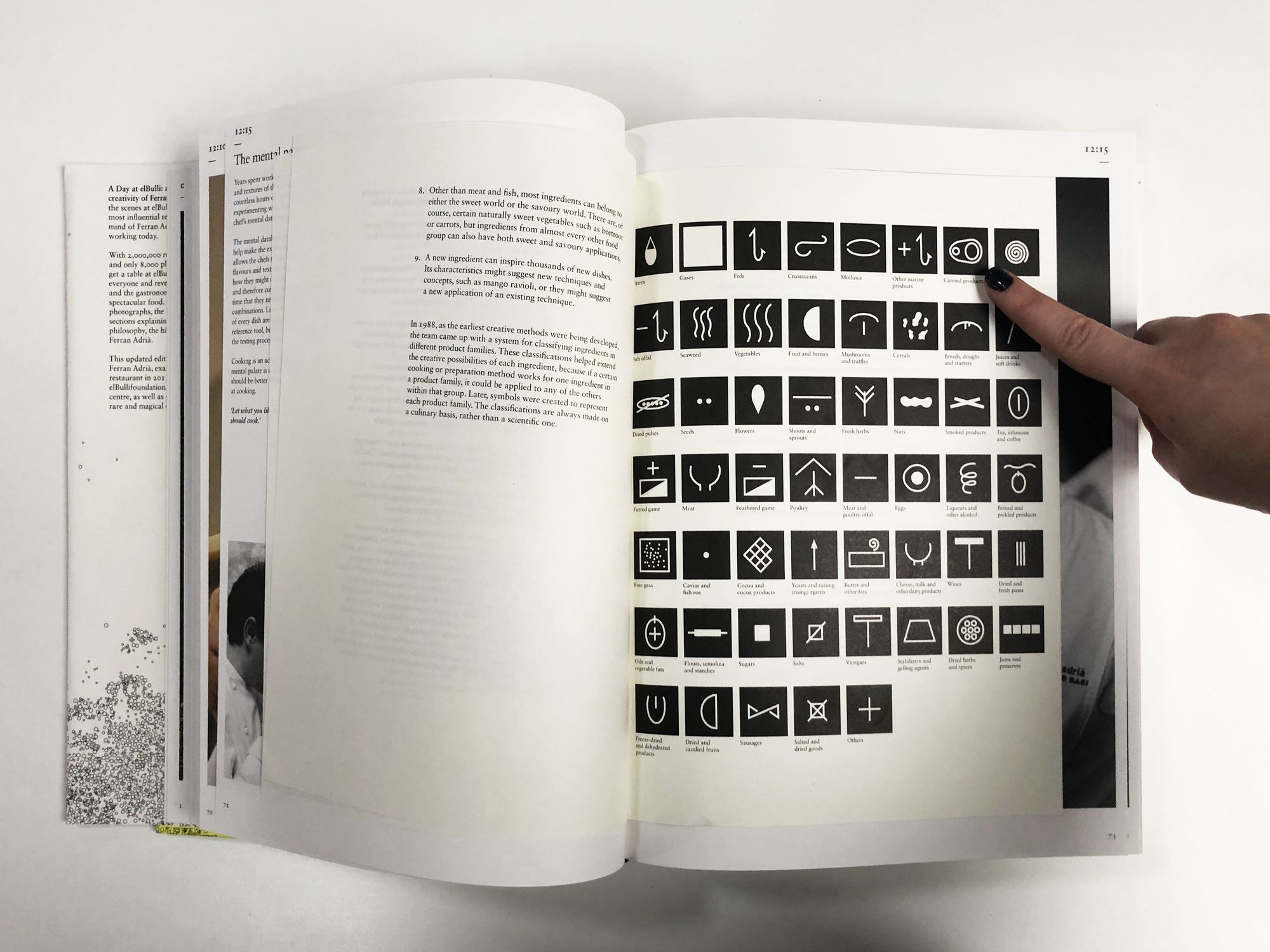
Allergens list at "A Day at Elbulli"
The Pop Tab
We’ve always described Graphext as the key to open data’s black box and that is exactly what a pop tab does. It had a meaning that reflected our vision but it was still fun and different, just how Graphext is. Also, it was shaped perfectly to fit squared proportions and most importantly: was simple.
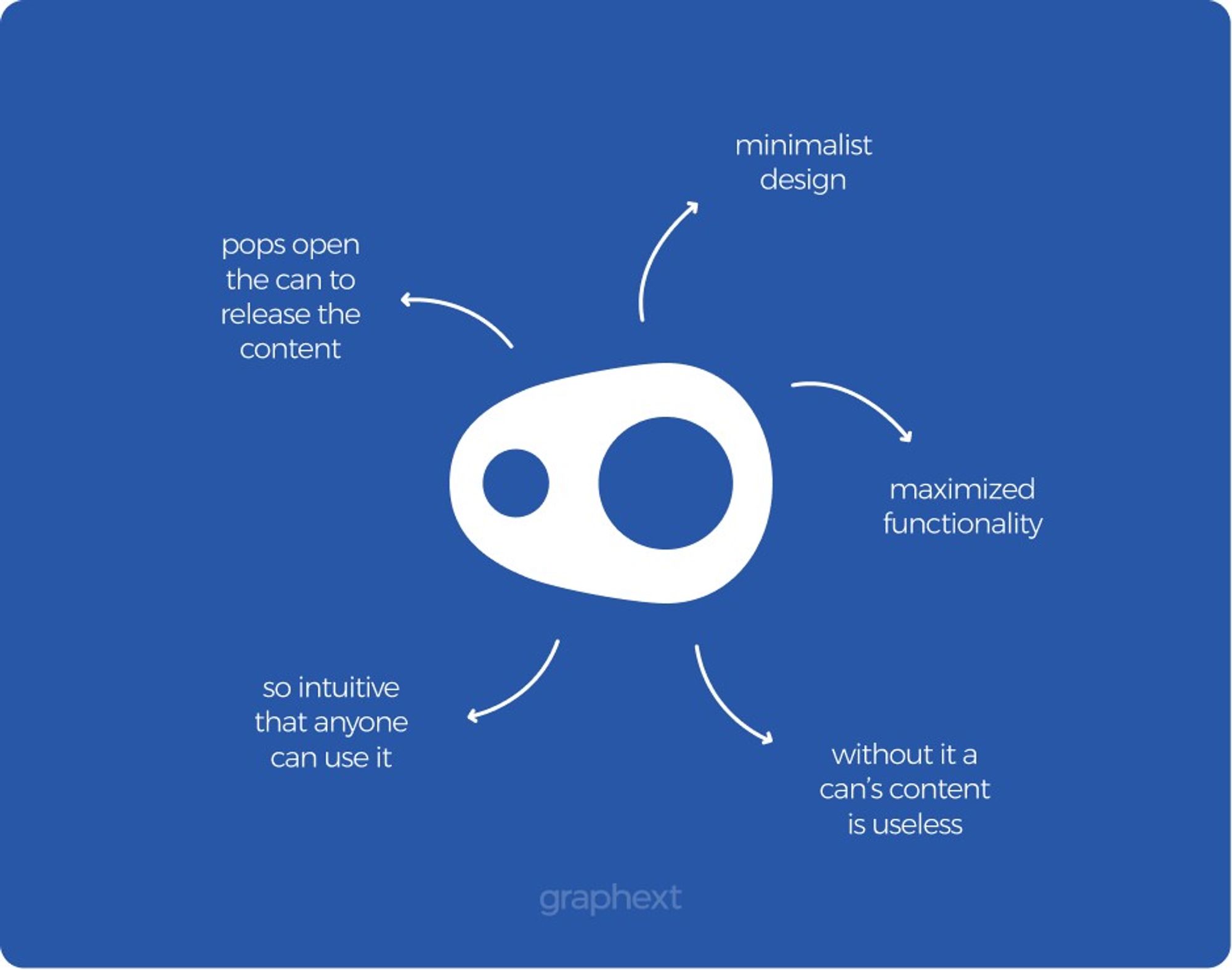
Meaning of the Pop Tab as the Graphext Logo
The concept on its own met all of our initial set requirements.
- it is an easy but powerful mechanism
- it is an untraditional icon in the industry
- the approach is absolutely unique
- it is a simple shape
- it is remarkable
- it maximizes the space
In other words, the conceptual representation of the pop tab itself aligned perfectly with our own vision. We just had to make sure that the functional needs were fulfilled too. After trials, drafts and modifications we reached the final version of the pop tab icon:

Our new logo
We now have an image that can be used in different sizes, dimensions and backgrounds and that can be used with and without our lettermark. Along with the new icon we implemented a new typography that allows us to have a consistent identity.


Inside the Interface
Now that we have a brand new look we wanted to see its results on our product. And this is how our new logo looks like in our UI!
The possibility of modifying the color of our logo to match the dark color scheme and being able to choose from using only the icon or icon + lettermark is a life changer. It has given us the freedom to adapt the image to our needs without loosing a bit of consistency.
As our UI is filled with information we needed something compact yet remarkable, for that reason we’ve decided to go for the icon only version of our logo.
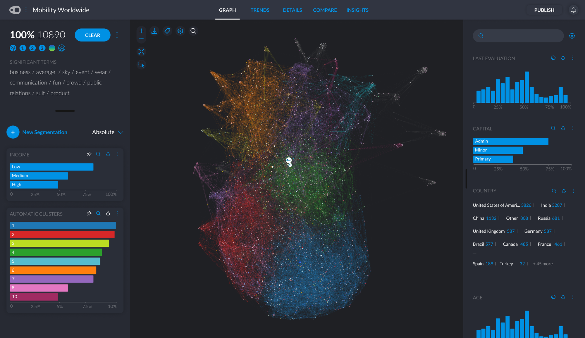
The new logo on the top left corner in our exploratory interface
As for our webpage, we wanted to display our full name and we had the space to do it. This is how it looks!
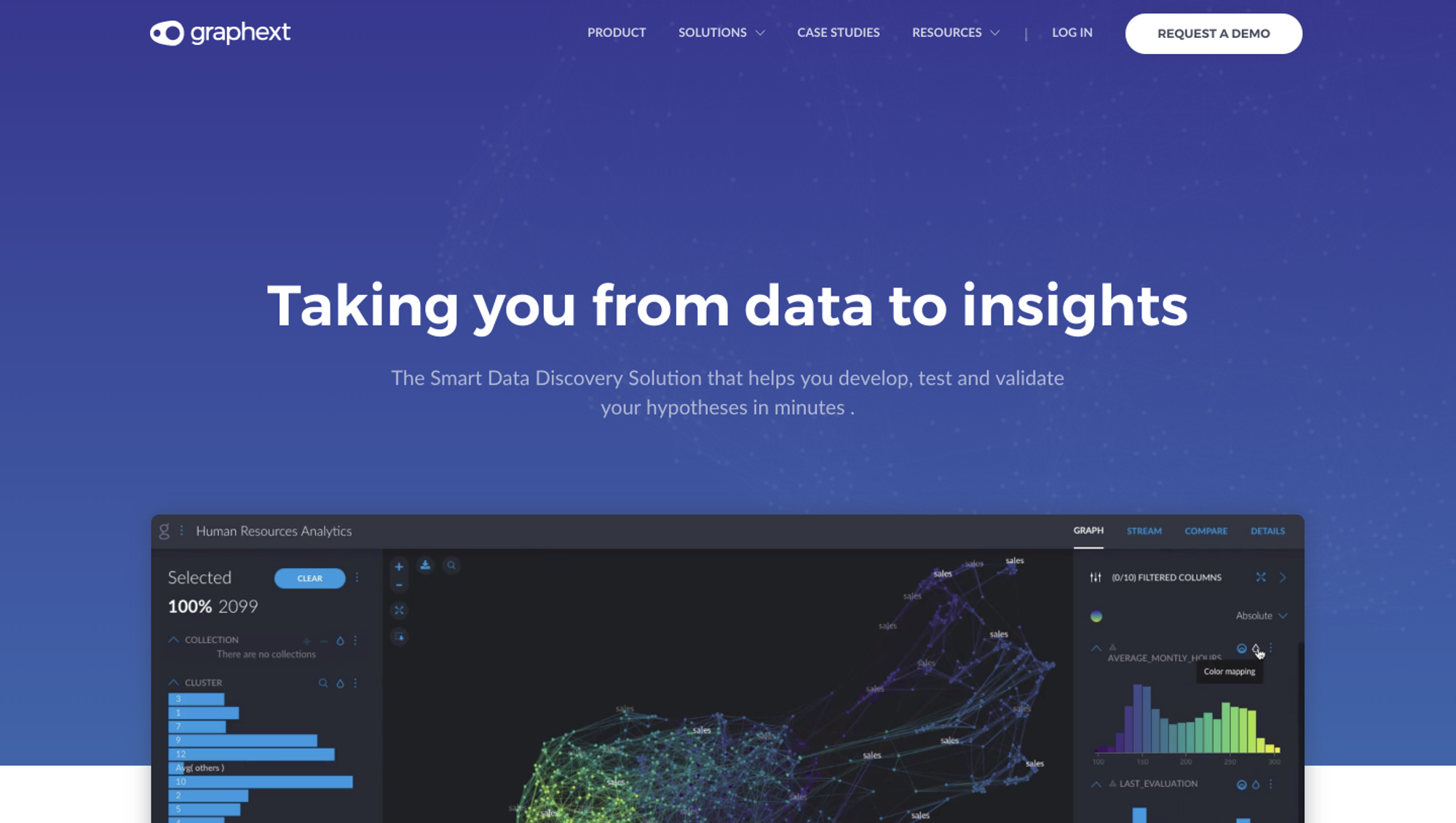
Our new logo looking neat in our product page