
Using Mutual Information to Cluster Variables and Discover the Associations Between Survey Questions
Our team set out to build a type of analysis that could be used to measure the strength of association between variables in a dataset. Here's how we did it ...
Understanding how variables are related to one another can be a crucial part of data analysis. Studying these relationships can reveal which experiences are shared by survey respondents or expose a clear correlation between diet and health problems. Generally speaking, this kind of analysis involves grouping - or clustering - variables based on the closeness of their relationships. When working with data containing lots of variables, analyzing this process can provide some of the best insights into a dataset.
Clustering variables helps to understand how the values for column A are affected by changes in the values for column B.
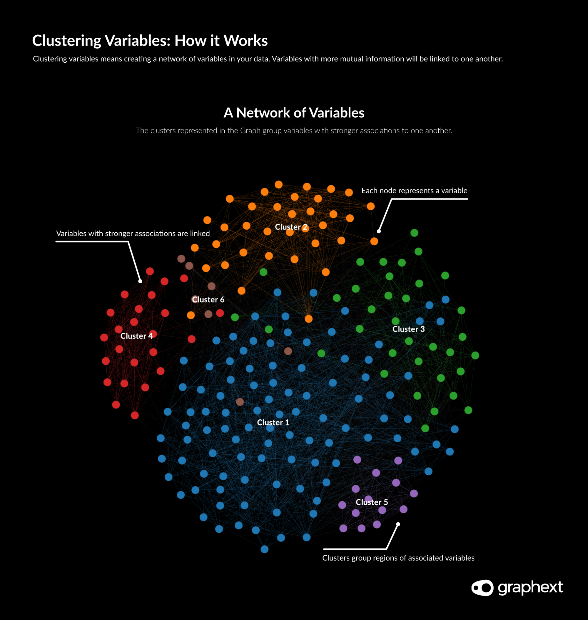
Graph: Clustering variables means creating a network of columns in your data.
Not only this, clustering variables by their relation can be really useful when building a machine learning model. Strongly correlated variables can influence predictive models in undesirable ways, giving more weight to these variables in the model's performance. Gaining an understanding of the variables that are strongly related to one another helps to drive smarter decision making when considering the factors fed into the model.
Understanding that obesity and weight are strongly correlated would enable us to choose only one of these variables to use as a factor in a model that predicted heart disease probability.
Measuring Variable Relationships with Mutual Information
Our starting point was to establish a method for measuring variable association. The Pearson Correlation is a common measurement used to calculate the relationship between a pair of variables. Although this method is accurate in calculating linear relations among numeric variables, it fails to deliver good results for categorical variables and non-linear relations.
Pearson Correlation is a common statistical method used to measure variable relationships but doesn't work well for non-linear relationships.
Since Graphext supports a diverse range of variable types including lists, dates and categorical values, we needed a method to calculate linear and non-linear relations among variables of any type. The solution we decided on was to calculate Mutual Information.
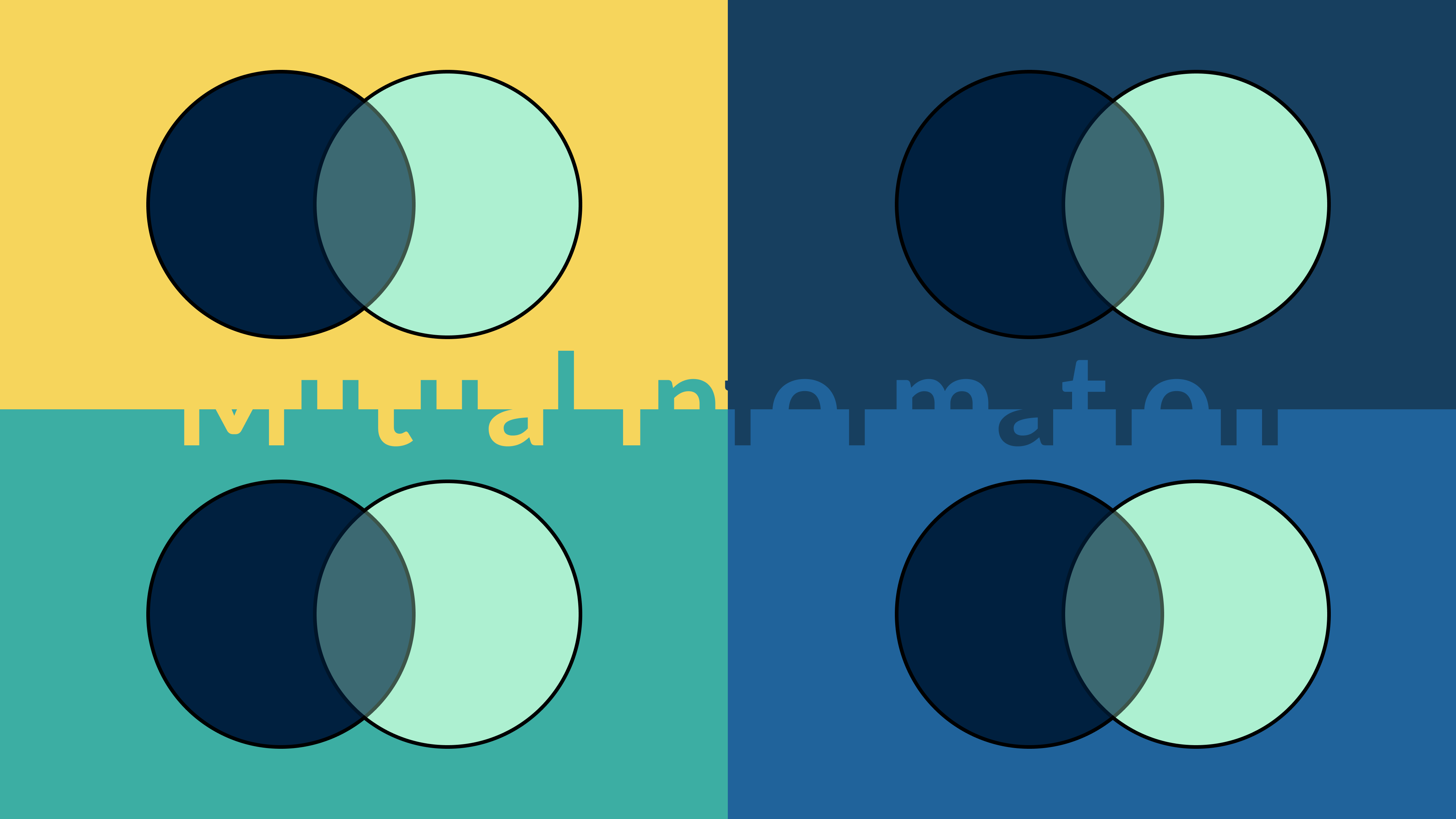
In a nutshell, Mutual Information quantifies the amount of information that we know about a variable by observing another variable. Thus, if a variable sufficiently provides information about the behaviour of the other variable, these two variables are related.
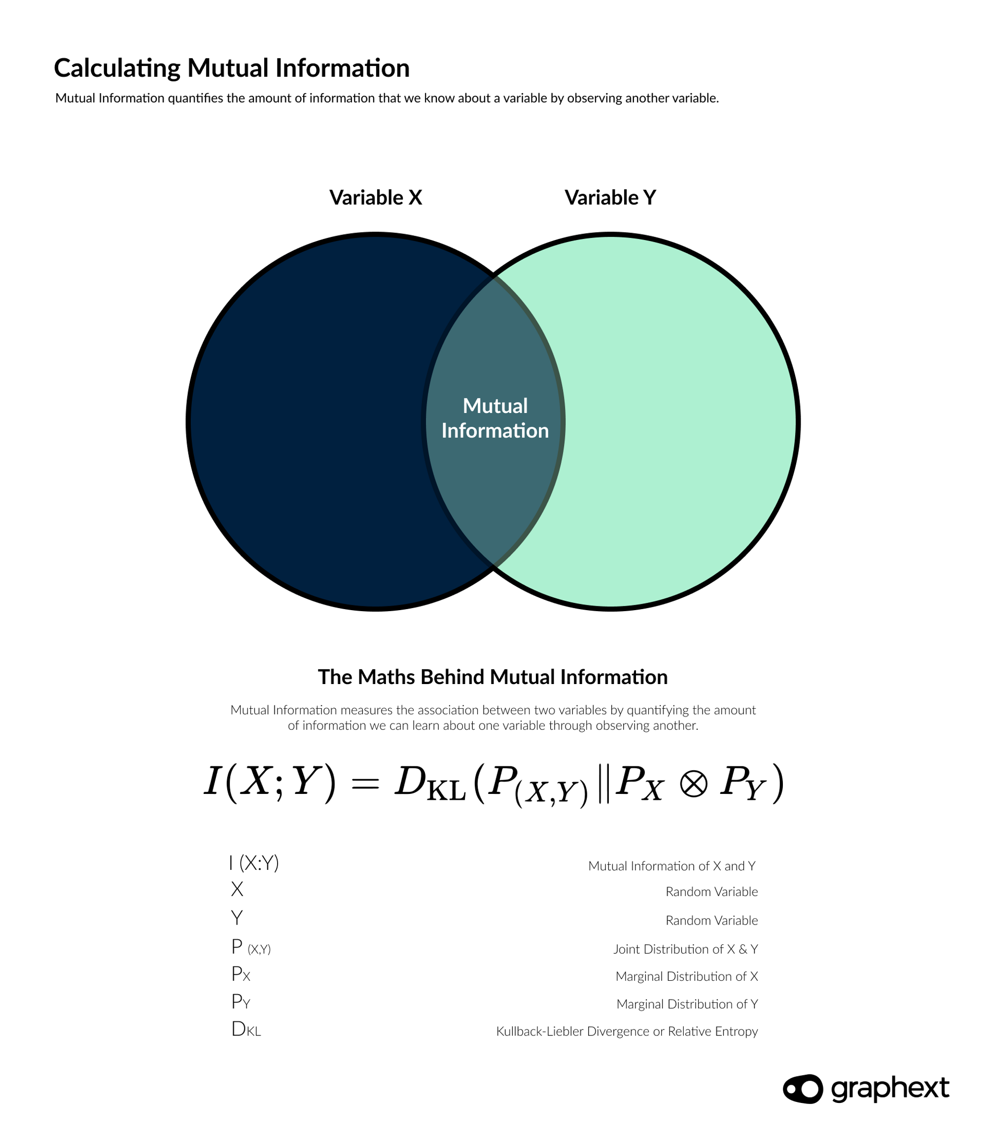
Mutual Information measures the association between two variables by quantifying the amount of information we can learn about one variable through observing another.
To give users quick access to analyzing the mutual information between variables in their dataset, weTo give users quick access to analyzing the mutual information between variables in their dataset, we built a flow built a flow especially for this type of analysis. Choose especially for this type of analysis. Choose Models → Cluster VariablesModels → Cluster Variables to begin studying the associations between variables in your data. to begin studying the associations between variables in your data.
Studying Mutual Information in Survey Data
Showcasing our new Cluster Variables analysis type, we built a project using data from a survey on mental health during the pandemic. This dataset contains 3083 rows and 242 variables - a huge number - and therefore perfect for this type of analysis.
Survey data with lots of questions is perfect for analysis using the
Cluster Variables
.
The COVID-19 mental health survey contains questions about people's experiences and mental health surrounding the pandemic. On top of this, it includes political, demographic and physical health-related questions. Choosing to cluster all 242 variables, our team set out to find patterns and associations in the survey questions.
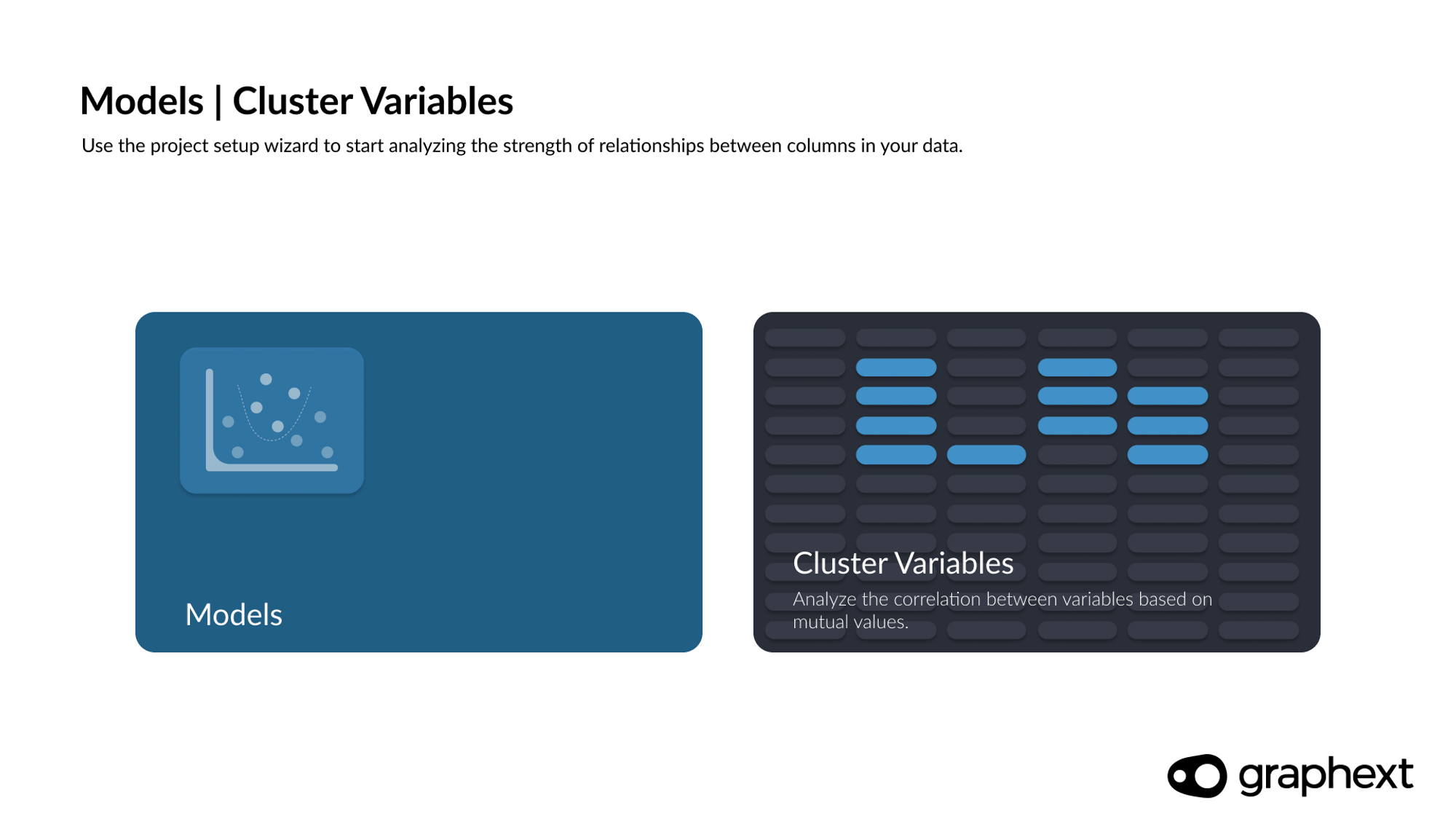
Choose Models - Cluster Variables to start measuring the variable association in your data.
We clustered all of the questions in a COVID-19 mental health survey in order to examine which questions were strongly associated with one another.
Setting a Target Variable
Alongside customizing our project with settings like a strength threshold to filter out weak associations, it is also possible to set a target variable for this kind of analysis. Target variables are variables we want to gain a deeper understanding of. Setting a target for Cluster Variables analysis lets us quickly examine the associations that other variables have in relation to our target.
Setting a target for Cluster Variables analysis lets us quickly examine the associations that other variables have in relation to our target.
By setting a b, Cluster Variables projects will be customised to show at a first glance which are the top related to your target variable. If no target variable is selected, then the project will provide a general overview of the relations among all variables.
For our team, we decided to use the question Voted Political Party in the Last Elections as our target. A leftfield choice, we know ... especially in an analysis of COVID-19 mental health data. But we were curious about the associations that mental health responses had with an out of context - politically oriented - variable.
The Project: At a Glance
Opening the project immediately reveals a network visualisation - the Graph - wherein each node represents one question in the original survey data. Nodes linked together according to their associations and colored according to their relationship to our target variable; Voted Political Party in the Last Elections.
Here's how we got here ...
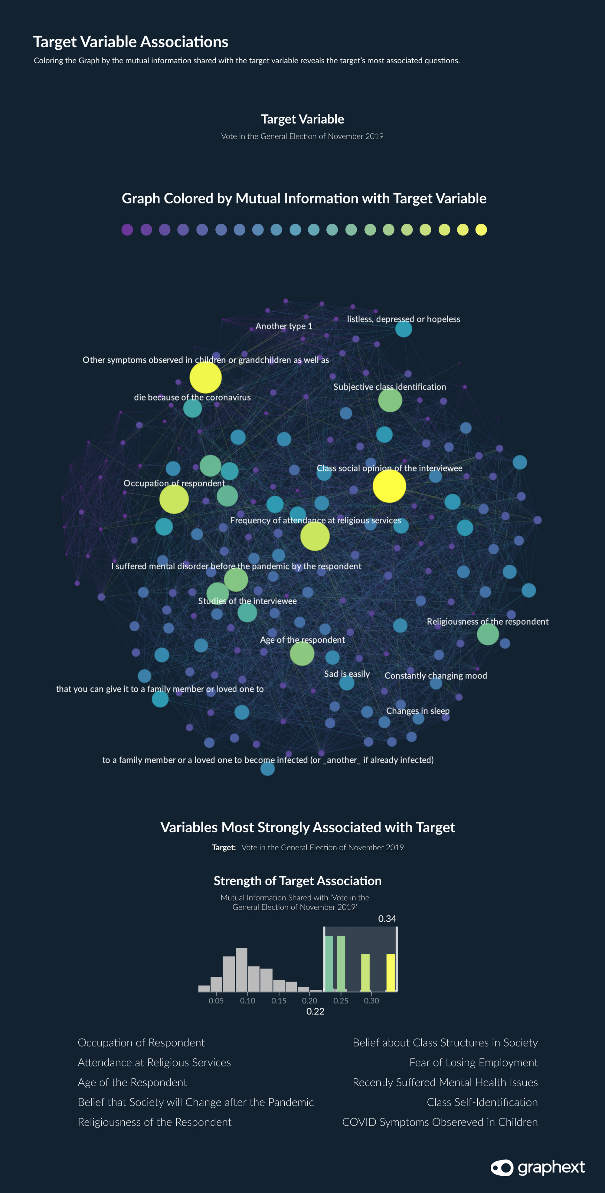
Graph: Top ten variables most associated with our target variable.
Each variable sidebar chart presents a distribution of the Mutual Information between that variable and other variables in the data. The higher the value on the bottom axis - the stronger the association between the variables. We can filter using these charts to reveal associated variables with varying degrees of strength.
Isolating the questions most associated with the way that survey respondents voted in the last elections revealed some obvious trends. Both the age and religiousness of the respondents were strongly related to the way they said they voted. But ... there were some unexpected relationships on display here too. Both the way that respondents answered questions concerning fear of dying of COVID-19 and a fear of social isolation were strongly associated with their political stance.
The age of people and their religiousness were strongly associated with the way that they said they voted.
Turning our attention away from our target variable, the team began to inspect the clusters generated in our project using color mapping. Clusters can help to quickly identify groups of variables that have a generally high level of relation.
Inspecting the content of clusters revealed that the nature of the question had a significant influence on its strongest associations. Diseases related questions form a very well differentiated cluster indicating that responses to questions regarding diseases are often related. The same appeared to be true for questions related to children and to medicine.
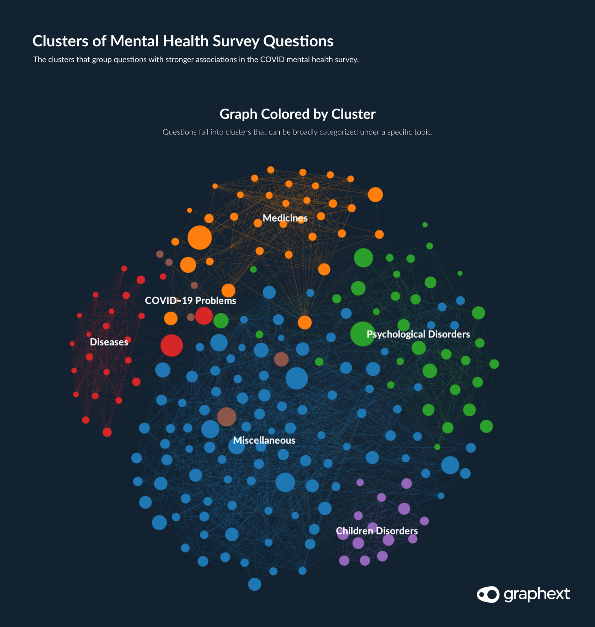
Graph: The clusters grouping columns were well defined.
When building predictive models, it would be unwise to include too many variables from the same cluster as this could skew the model's performance.
Using the sidebar variable charts and a process of filtering the strength of mutual information, it's possible to inspect the patterns behind any question in the survey.