

Models
Clustering Supermarket Transactions

Updated
August 19, 2021
Clustering is a machine learning technique used to group data points based on similarity. It can be used to segment markets, employees, footballers or products and is a powerful way to discover hidden relationships in data.
Finding patterns in huge quantities of data isn't easy. By linking one data point to another based on shared or similar values, clustering models can detect valuable, hidden connections in your data.
“The goal is to turn data into information, and information into insight.”
— Carly Fiorina
Clustering models can be difficult to execute with Python or R and often involve many time-consuming iterations that can only be performed by data scientists. The project we'll build here takes minutes to set up letting us quickly start inspecting the data for insights.
About This Guide to Clustering Supermarket Transactions
This guide is intended to walk you through the process of creating a clustering model to group your data. We'll be using a dataset of 1000 supermarket transactions from stores in Myanmar. The aim of our project is to group these transactions in order to find patterns in the buying habits of the supermarket's customers.
After walking through the process of creating a clustering model using specific factors to calculate the similarity between rows in our data, we'll inspect the network visualisation that Graphext generates.
Networks are perfect for representing clustering analysis and pull data points towards one another according to the links between them.
First, we'll use color mapping to spot immediate patterns in our network related to important variables like Unit Price and Quantity. Then, we'll focus on a valuable cluster of transactions and inspect the defining features of customers making purchases in this cluster.
Download the dataset here.
Step 1. Building the Project
Uploading the Dataset
First, we need to upload the dataset to Graphext. Make sure you have the dataset downloaded to your computer and navigate to the workspace of the team that you want to build the project in.
From inside the Datasets panel, select New Dataset and either upload the file or drag and drop it into the workspace.
Once your data has loaded, open it up. You should see a table with 1000 rows and 17 columns. Each row represents one transaction in the supermarket and information is given on the purchase price, quantity and product line alongside data on the customer making the purchase.
Take a second to scroll through the data and familiarize yourself with the variables. Next, we'll be picking some to use as factors to calculate similarity for our clustering model.
Setting up the Project
From your project setup wizard, choose Models as your analysis type and then select Clustering from the list of sub-analysis types.
After selecting Clustering, Graphext will ask you to choose targets and factors to calculate the relationships between rows in your data.
Target: The variable you want to gain a deeper understanding of.
Factors: The variables used to calculate similarity.
In this project, we won't be using a target variable so keep that field blank. Turn your attention to the list of Other Variables. To calculate similarity we want to use as many of the useful variables as possible. Select the following variables from your list of Other Variables and move them across to your list of Factors.
Branch - City - Customer Type - Gross Income - Payment - Cogs - Gender - Product Line - Unit Price - Quantity - Total - Month - Weekday - Hour
After you've done this, move on by clicking next. Name your project something like 🛍️ Clustering 1000 Supermarket Sales and execute the project. That's it.
Step 2. Exploring the Project
Great! Your project will take a few minutes to execute so sit tight. Once it's ready you will be able to open it from the Projects panel of the team workspace where you built the project.
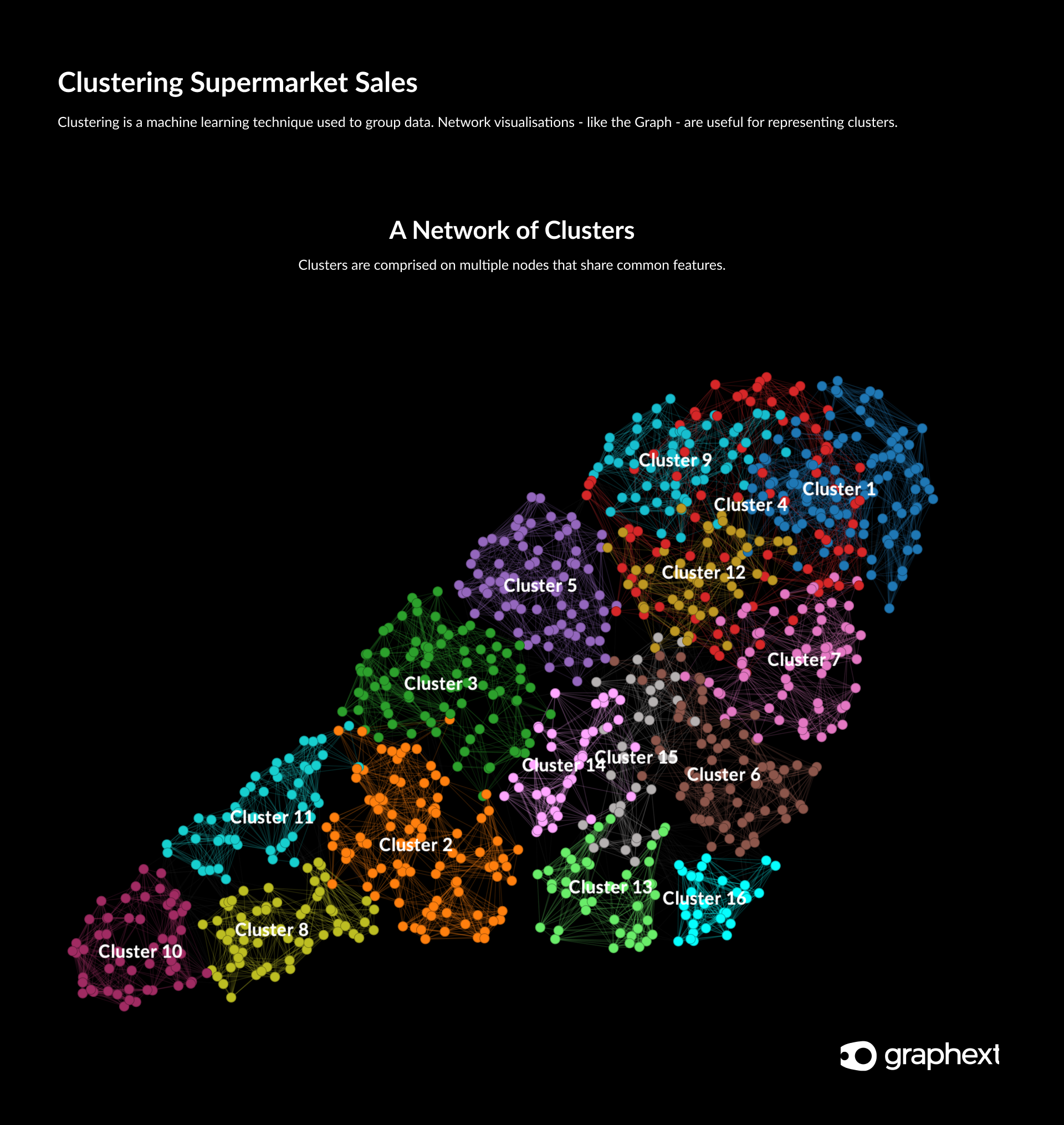
Open up the project to reveal the network visualisation (Graph) mapping the connections between supermarket transactions in the dataset. Take a second to inspect the Graph and the sidebar charts that show the distribution of values.
Inspecting Clusters of Supermarket Transactions
Find the UMAP_Cluster variable chart in your left sidebar. Click the +6 more button at the bottom of the chart to reveal all of the clusters in your network. It appears that Graphext has grouped the dataset into 16 nicely defined clusters.
Remember each node (circle) in the network represents a single supermarket transaction. Clusters represent groups of transactions that share specific similarities.
Color Mapping
Now that we have a grip of the 16 clusters grouping our data, lets start to find patterns in the Graph using color mapping.
In a dataset of transactions, the price and quantity of products sold are typically two of the most significant variables. Find the variable Unit Price using the search bar in your right sidebar. Click the raindrop icon corresponding to Unit Price to apply color mapping to this variable.
You should immediately see that nodes in your network have changed color to represent their value for Unit Price.
Transactions that involved more expensive items are bright yellow in color and those that involved cheaper items are purple in color. There is an obvious pattern in the data here. Transactions involving more expensive items are grouped towards the bottom of the Graph.
Try applying color mapping to the Quantity variable to inspect whether there is a similar pattern at play. Click the raindrop icon corresponding to the Quantity variable and notice that nodes have changed color once more.
Color mapping is a useful way of instantly spotting patterns amongst your clusters.
It seems that there is a similar pattern in the data regarding the Quantity of products bought in a transaction. Instead, transactions involving a higher quantity of products are grouped towards the top of the Graph and those involving fewer products are grouped towards the bottom.
This seems to indicate that customers that buy more expensive items also buy fewer items but customers buying cheaper items will often buy a higher quantity of them. This makes sense!
Step 3. Inspecting a Valuable Market Segment
Notice that Cluster 10 contains a high density of bright yellow nodes when either Quantity or Unit Price color mapping is applied. This seems to indicate that customers in this cluster are buying lots of expensive items.
They might be one of the most valuable market segments for the supermarket and it would be good to investigate the features of this cluster further! ****
Filtering a Key Cluster
To inspect the features of Cluster 10 in more detail, we need to use filtering to select data points exclusively in this cluster. Find the UMAP_Cluster variable from your left sidebar and click on the bar representing values for Cluster 10. Your Graph will automatically zoom in to this cluster and you should be able to see that the active data in your project is now restricted to values in Cluster 10 - 57 rows (6% of the entire dataset).
Now, from the top of your right sidebar, change your Absolute | Relative dropdown so that it is set to Relative mode. This means that your sidebar charts will represent the features of cluster 10 in relative proportion to values in the whole dataset (it's easier to spot patterns this way).
Identifying the Features of a Key Cluster
Now that we have selected only values for Cluster 10, let's inspect the features of transactions made in this cluster.
Take a look through the charts in your right sidebar and look out for any blue bar - representing the values for Cluster 10 - that stands out from the grey bar - representing values for the whole dataset.
Find the charts representing Unit Price and Quantity. You should immediately see that for both of these variables, values for Cluster 10 transactions are grouped towards the higher range of values. This indicates that this customer base is buying lots of expensive products - exactly as we thought.
So the next logical step would be to find out what kind of products these customers are purchasing. Use the search bar to find the Product Line variable and inspect the chart. It looks like the most popular product type in Cluster 10 is Food & Beverage items.
Step 4. Digging Deeper into the Features of a Key Cluster
Now that we know that the store's most valuable cluster of customers are purchasing Food & Beverage items, it would be a good idea to learn more about the preferences and characteristics of this customer base.
Find the Product Line variable chart and click on the Food & Beverage bar to filter the data once more. Now your data should represent only customers in Cluster 10 that bought food and beverage items.
Inspecting the Features of a Key Customer Segment
With the filter active, you should see that your active data now represents just 1% - or 14 rows - of the entire dataset.
Time to take a look through the variable sidebar charts to find the defining features of this key customer segment. Make sure you have your Relative | Absolute dropdown set to Relative mode so that we can easily spot patterns and start to browse the charts.
If we were conducting this investigation on behalf of the supermarket, we would now be looking for insights to direct specific and relevant marketing action. To do so, we'd need information on where these customers are based as well as who they are and when they shop!
Find the Gender variable chart. Notice anything significant here? Yep ... most of the customers in this key segment are female.
Now search for the City variable chart. Again we have a clear pattern here. It seems that most of the customers in this key segment are in Naypyitaw - one of Myanmar's major cities.
Since we've managed to achieve some pretty detailed insights about the data's most valuable customer base, we'll stop our analysis at this point. Nonetheless, there are many more ways that we could approach this dataset to find specific insights about segments of the supermarket's customers.
If you are interested in continuing the investigation beyond this point - check out the full study that our team conducted on this data here.
Need Something Different?
We know that data isn't always clean and simple.
Have a look through these topics if you can't see what you are looking for.
CONTENTS

