

Data Academy | Exploratory Data Analysis
What is Exploratory Data Analysis?
Updated
September 21, 2021
Exploratory data analysis (EDA) in its most basic definition simply means getting to know your data. It is - pretty much always - the best way to start analysis and involves loading, preparing, inspecting, visualising and transforming a dataset.
It's the first opportunity to spot patterns in your dataset and probably defines how your analysis will proceed. But the best-kept secret about EDA is that it's an iterative process - not a linear one.

In exploratory data analysis, the analyst firstly aims to become familiar with the contents of a dataset. This might involve spotting missing or corrupt values, inspecting the value distribution of key variables or determining the type of values that exist in the data. For quantitative values in the data, analysts can use descriptive statistics to determine the mean, min, max and quartile ranges in the data.
After getting a sense of the dataset contents, the analyst can begin to shape it for use - perhaps transforming some values or casting an incorrectly labelled text column to a categorical one.
The analyst firstly aims to become familiar with the contents of a dataset - spotting anomalies and understanding value distribution. Then they can begin to transform the data so that it is ready to model.
At the same time as cleaning and transforming the data, the analyst will also be searching for patterns in the data. They might already have some suspicions about variable correlation or the suitability of variables to use in their models. This is where data visualisation becomes the tool of choice. Using histograms, box plots, scatter plots, heat maps and other chart types, the analyst can study value distribution, understand simple relationships and catch extreme values.
Sounds simple enough right? Most EDA techniques aren't especially complicated but instead offer ways to bridge the gap between the contents of the data and the analyst's hypotheses.
But hypotheses evolve. As data scientists report their findings, business teams will ask more questions of the data. The insights that can be found in the first few visualisations of the data will prompt further investigation of focus areas. The simple models that analysts first create to study variable relationships should lead to more refined models. But before moving on to conduct specific analysis, the analyst will return to exploratory data analysis again.
This is why EDA is an iterative process.
Businesses that rush through exploratory data analysis will probably waste time down analysis rabbit holes that could have been avoided. This is the realm where assumptions are formulated and tested rigorously and should involve an open dialogue between business leaders and data scientists.
Data Preparation
After loading the data from its source into an analysis friendly format, it needs to be prepared. Most analysts will agree that this is often a laborious task. Cleaning, transforming and shaping (see below for definitions) the data occupies most of the time and effort here and largely takes place before analysts get a chance to visualize the dataset.
This said, visualising data helps to highlight its inconsistencies. Analysts will typically return to prepare the data further after creating their initial series of histograms, box plots and other exploratory charts.

Cleaning Data
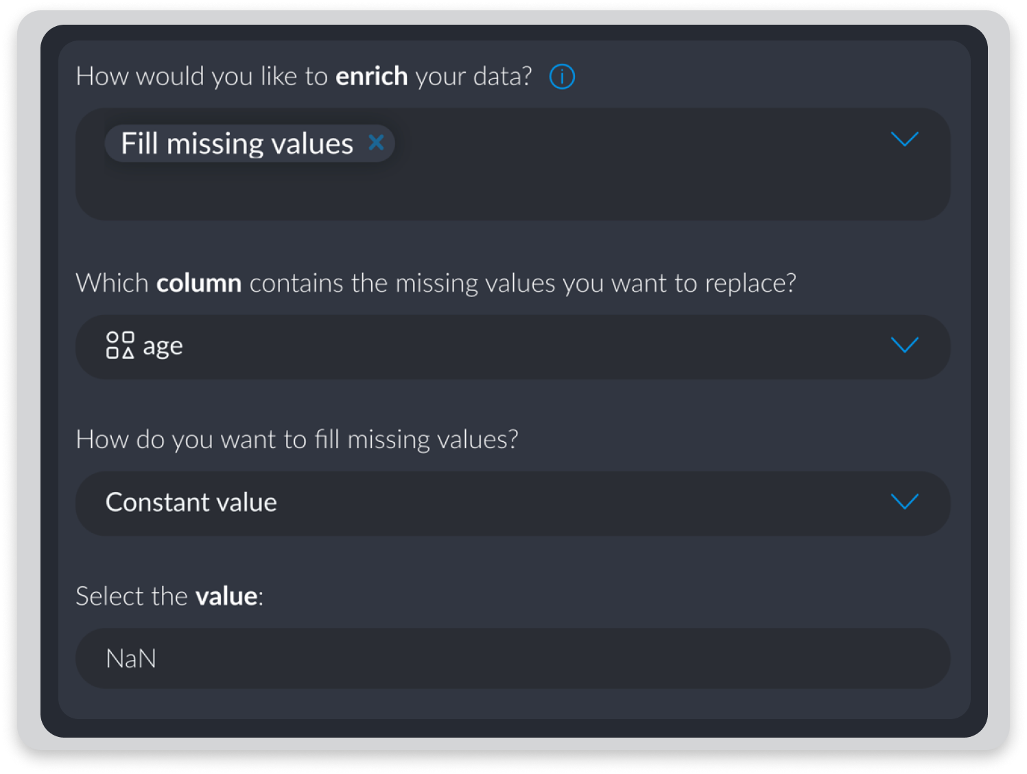
Cleaning datasets is a big part of the data preparation process. Lots of missing values might be useful in specific contexts but analysts might choose to remove columns or fill those missing values with relevant ones. Another important aspect of cleaning data involves correcting corrupt or inaccurate records - something that can frequently occur with dates and times saved in specific formats.
"I kind of have to be a master of cleaning, extracting and trusting my data before I do anything with it."
Scott Nicholson, Data Scientist
Shaping Data
Joining, Aggregating & Sampling
Datasets will often require shaping for specific forms of analysis. Shape refers to the rows, columns and structure of a dataset. Joining datasets often involves adding information from a second table that shares some information - typically an ID column. Aggregating data means summarising your data around a specific variable. Often known as grouping data - aggregation results in each row in your final dataset representing the summary of values that share a unique value for your set variable(s).
Sampling data will also change its shape. Sampling rows that meet specific criteria gives you the ability to refine your analysis to specific communities in your dataset.

Transforming Data
Enriching, Normalizing and Casting
After inspecting datasets, analysts will often need to transform them in some way. This might be because the data is insufficient or because the type or range of values in the data is not appropriate for the analyst's chosen analysis.
Enriching datasets involves using existing variables to produce new ones. Examples of data enrichment include extracting detailed time and date information from a general date field or adding address information using latitude and longitude values.
Setting or casting variable types involves changing the kind of value in a column - quantitative, text, list, categorical etc. Working with incorrect variable types limits the ways that analysts can later manipulate datasets. Normalizing values in a dataset is a useful way of accounting for anomalies by reducing the distribution of values according to a set scale.

Data Visualisation
Visualising data as part of the exploratory data analysis cycle helps analysts to understand immediate patterns in the data, catch extreme values and begin studying variable relationships. Univariate visualisations measure the values of a single variable whereas Multivariate measures the values of more than one variable.
The type of visualisation you need will depend on how many values you are inspecting and what type of values you are working with.

Univariate Visualisations
Histograms, Box Plots & Pie Charts are among the common chart types used to visualise the values belonging to a single variable. Box plots - in showing the quartile ranges belonging to a variable - is especially useful at describing univariate value distribution.

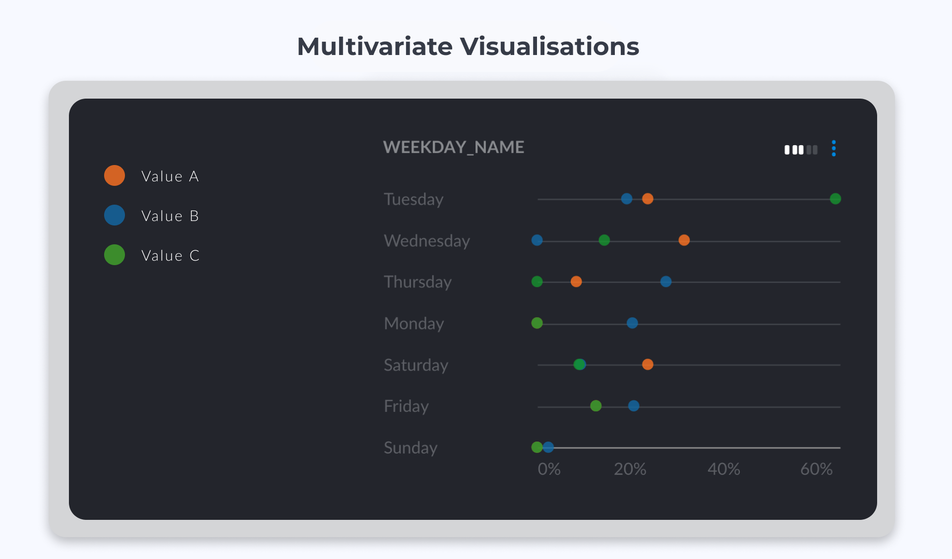
Multivariate Visualisations
Heatmaps, Scatter Plots and Time Series visualisations are among the most popular types of charts used to represent values from more than one variable. Networks are more complex entities and are generally used to explore communities in data that has been grouped according to one or more criteria.
Many businesses use dashboards, chart-builders and low-code tools to create data visualisations. Why? Because it is difficult to create good visualisations using Python or R.
Data visualisation is an incredibly important aspect of communicating insights from data. Well presented charts can negotiate language and cultural barriers as well as communicating complex ideas to people from all walks of life. But as well as being a key part of presenting data - visualisation is of prime importance in the EDA lifecycle as well.
Analysts rely on visualisations to understand which focus areas to move forward with and which areas of the dataset need further preparation.
Descriptive Statistics
Because data visualisations are often time-consuming and difficult to produce using Python or R, analysts will often turn to descriptive statistics as their first port of call when exploring a dataset.
Descriptive statistics describe a dataset by using a single or set of statistics to effectively summarize a collection of values. Analysts use descriptive statistics to summarize the full dataset or to summarize aggregated samples of it.

Averages are a key way of describing quantitative variables. Means are found by adding all numbers in the data set and then dividing by the total number of values. The median is the middle value when a data set is ordered from least to greatest. Quartile ranges and standard deviation help analysts to understand quantitative distributions in more detail.
Counts are more commonly used to describe categorical variables and provide a useful summary of the number of values belonging to each category. Often when analysts are describing categorical or boolean variables, they will aggregate (group) the data and then compare descriptive statistics from each group. In this way, they are able to inspect the min, max, mean and quartile range for values belonging to each group.
Why is EDA Important For Businesses?
As you might be starting to realise, EDA is an essential part of analysis in pretty much every context. According to a survey conducted in 2020 by Anaconda, exploratory data analysis accounts for two-thirds of analyst's time.

Problems, Anomalies & Outliers
Without inspecting datasets using exploratory data analysis methods, it's impossible to ascertain what the dataset actually contains. Quite often in business processes, data is passed through many different pipelines and databases before ending up in the hands of the analysts. This can result in corruptions that exist between values and that must be corrected at their source before analysis can be conducted on these values.
Anomalies and outliers are also problematic for some analysis types. Visualising data distribution or describing it with statistics helps business teams spot the extreme values in their data. These can often be of interest as they might point to interesting customer segments or products that aren't selling especially well. Even if they are not of interest, analysts might prefer to normalize values where anomalies are skewing the distribution of values.
Getting a Sense of the Data
Studying the contents of a dataset is how analysts and business decision-makers understand what kind of analysis they can and should do. When business leaders are interested in answering specific questions, data science teams must check how these questions can be answered with the variables existing in their data.
What's more, once business teams have a sense of the quality and type of variables on offer - they will want to ask simple questions of the data. These might include - how many cucumbers have we sold on Saturdays this year? Or - what is the average age of users spending more than 4 hours on our platform each day? These questions can often be answered with exploratory data analysis
Before Models Get Built
Models are fragile things that often are influenced by the smallest of changes. Knowledge of a dataset's contents is an essential part of building effective models.
Data science and business teams must communicate effectively to ensure that appropriate factors are chosen when performing predictive tasks. Choosing a bad combination of factors for a model will mean that the model is largely useless. What constitutes a good or bad combination of factors is often decided during exploratory data analysis.
Exploratory data analysis crucially helps business teams to start spotting patterns in the data. These patterns - that are initially found in multivariate visualisations - often provide foundational thinking for model creation. Put simply, if you find something when you are exploring a dataset - it is probably a good idea to explore it further by modelling the data.
Conclusions & Further Reading
Exploratory data analysis isn't particularly complex but it is especially useful. Datasets become far more useful and often more interesting after they are loaded and prepared by analysts. Business teams that emphasize time spent on EDA will often save time that would otherwise be wasted on pointless lines of enquiry.
What's more, many simple business questions can be answered purely by visualising or describing datasets. Whilst data modelling is powerful, it is no good at all without knowledge of the specific contents of a dataset.
If you want to learn more about EDA, here's some of our favorite articles on the topic.
- IBM Cloud Education - Exploratory Data Analysis
- Analytics Vidhya - A Python Walkthrough | EDA Introduction
- John Tukey - Exploratory Data Analysis | Book
Need Something Different?
We know that data isn't always clean and simple.
Have a look through these topics if you can't see what you are looking for.
CONTENTS

